 |
|
| |
|
 |
|
. |
|
||||||||||||||
copyright
©1999-2000 |
4. Use
the colors in the artwork to accentuate colors in the room.
It’s a little anal-retentive, to be sure, and there is such thing as
going too far with the matching madness, but a little bit of color
coordination between wall art and furnishings will do wonders for making
both the art and the room look better. If you’ve got your room
decorated in cool muted tones, you may want to stick with artwork in a
similar palette. Or if you’ve 5. Know the basics of good balance. Decorators are always talking about how crucial it is to find the "right" balance when it comes to arranging objects in a room. Which basically just means that you want things to look like they’re sitting in the proper location – not too high, not too low, not too far left, not too far right. Hopelessly vague advice, no? Fortunately, there are a few rules that generally hold true when it comes to finding balance in arranging pictures. Hanging pictures dead center on the wall can often produce a strangely deadening, almost un-balanced effect. On a blank wall, for instance, with no furniture against it, pictures will tend to look more balanced in that big empty space when you leave a little more space below the picture than above. And when working with frames of different sizes, hang the wider one on top; it’ll look more balanced than if the narrower frame is on top. Still another useful balance tip, passed along to me by an academic advisor when I was hanging a photo exhibition: You’ll want more space between the edges of the walls and the pictures than between the pictures themselves. 6. Hang pictures in clusters. Grouping brings order, and is especially useful when you’ve got a bunch of smaller pictures. In general, it’s a good idea to group together images that have a common theme or look. If you think you want to go eclectic, the key is to go all-out – randomness works best when you’ve got your walls jam-packed with pictures. Keep in mind that the space between pictures in a grouping should be much smaller than the widths of the pictures themselves. ---------------------------> lounge . nourish . host . laze . home.
|
||||||||||||||||


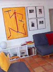 got a room painted in a snazzy ruby red,
you may
decide not to fight the boldness of the wall color with additional
color, but to go with stark black and white images instead. Using colors
effectively doesn’t have to mean that your artwork matches your throw
pillows; it just means that you should be aware of the effect the colors
of your pictures will have on their new surrounds.
got a room painted in a snazzy ruby red,
you may
decide not to fight the boldness of the wall color with additional
color, but to go with stark black and white images instead. Using colors
effectively doesn’t have to mean that your artwork matches your throw
pillows; it just means that you should be aware of the effect the colors
of your pictures will have on their new surrounds.